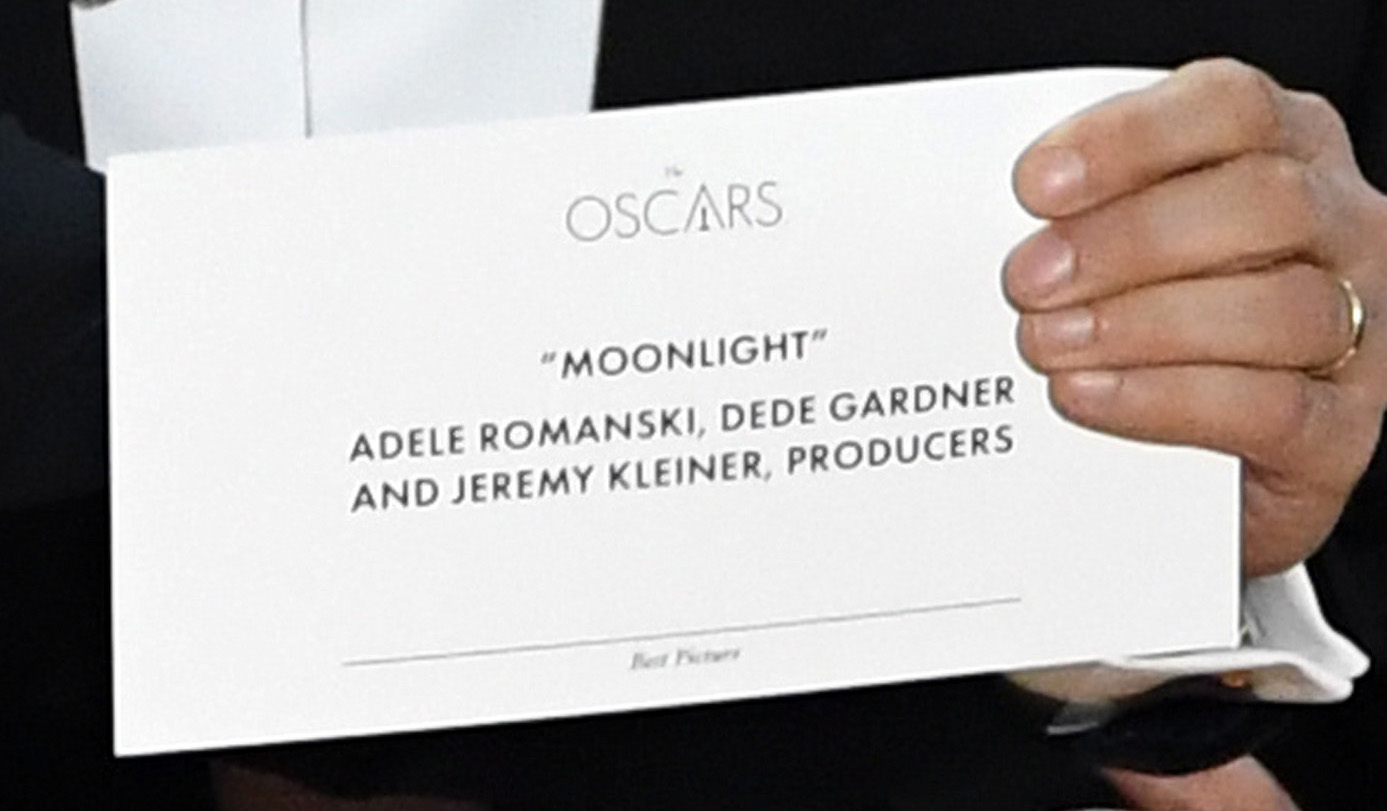
The awkward Best Picture announcement at the Oscars Sunday could have been avoided. Regardless of how Warren Beatty and Faye Dunaway got ahold of the wrong envelope. The horrible user experience that followed was unnecessary. Presenters should be able to tell the category through even a glance. Thanks to weak typography and illogical hierarchy the wrong winner was declared amid confusion.
The All-Powerful Hierarchy
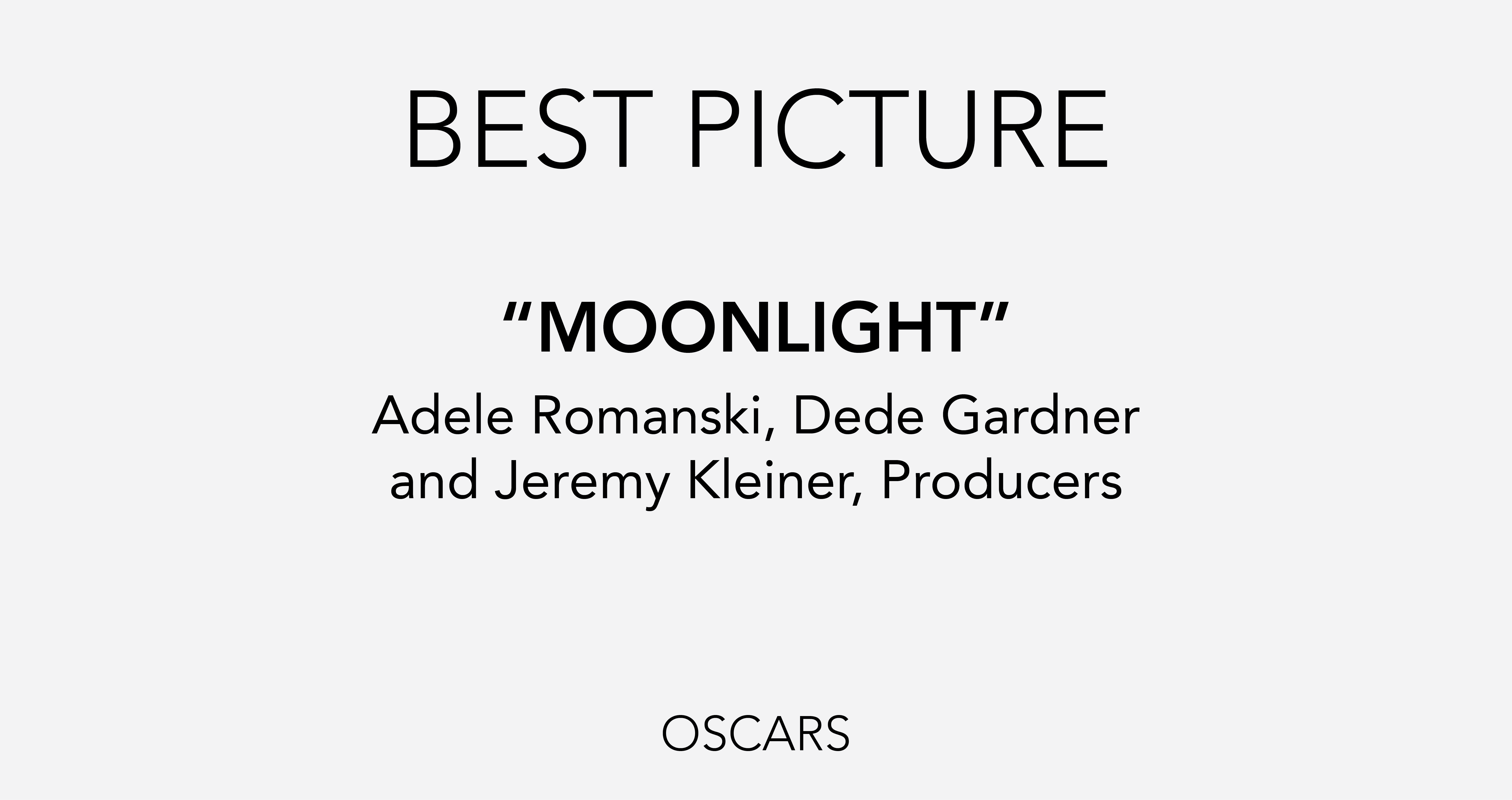
Best practices of content hierarchy ensure accuracy and a much better user experience for the presenters and the winners. Legibility, scan-ability and readability are all hot buttons when we design. Here’s how we’d redesign the card:
- The award name is at the bottom, tiny and oblique. Easily missed, as evidenced by Beatty’s confusion on stage. We moved the name of the award to the top of the card in large, all caps type. Beatty would have immediately known that he had the wrong envelope and the La La Land/Moonlight debacle would not have occurred.
- The winning name is too small and blends in with the subhead. We differentiated the two pieces of information by using all caps and bold type on the primary winner and smaller, lowercase for the other information.
- The use of the Oscars Logo at the top of the card (the largest element!) is an unnecessary waste of space. The logo can stand strong, smaller at the bottom of the card.

This mistake is reminiscent of the “hanging chad” issue from 2000. The artistry of excellent design is transparent. Like Shakespeare’s negative capability, well designed work brings the message to the forefront. Good design is good business.
#McKennaDesignGroup #Oscars #GoodDesignisGoodBusiness #MDG15thHour
